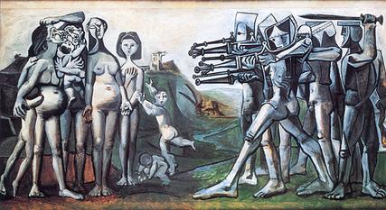
Massacre in Korea (1951) 60 x 115 cm / 23.6 x 45.3in $340 $220 Orig size 109 x 209 cm / 42.91 x 82.3in.
Philippe Deligant
IN THE pre-1912 years of the Paris art scene, the square format was not used much as it imparted a
static look to images. But, images freed from the restrictions of perspective challenged the compositional ‘rule of thirds’ and opened the painter’s two-dimensional pictorial space to be depicted as multiple planes. As a simple form suiting minimal compositions where the support resonated with patterning, the square suited constructivist idioms
which played with symmetry such as Kenneth Martin’s mathematical systems.

Original size 109 x 209 cm / 42.91 x 82.3in.
In denying the tradition of landscape and portrait Malevich equalised up the picture plane as a square creating the non-sign.
Another change in the transition from classical academicism to Modernism was the artist’s play with the edges to stabilise pictorial contents. As the traditional order of paintings moved on from being established by graphic means the canvas edge became as much a compositional tool as part of the new subject.
Although Cézanne used his pictorial contents for compositional strength he also had to put something up against the forms, assigning importance
as a device to direct the eye around and about whatever the outer proportions were. That ‘something’ was often an edge.
In this work, one of the few square John Wells paintings I have seen, Wells uses the proportion to float his asymmetrical forms on the flattened picture plane.
The overarching inner tension and compositional strength is mirrored back to the forms from the square’s outer edges instead of coming from the marks. With the loss of the usual figurative references he drew from Gabo and Nicholson, Wells creates an image which recalls Hoffmann but with an additional dimension, a sense of the painting’s logic rising from an unseen mystical centre in the anonymity of his square space rather than the forms.
Wells and Heron were among the few artists who used the three square proportion, preferring the extended square beyond the normal rectangle. In the context of Cornwall the extended rectangle is pertinent to the landscape. As in Lanyon’s long murals for universities, the Penwith landscape is characterised by its lack of depth and low hills. The extended format, with the image pulled out to a three square proportion, lengthens the rectangle where the hills are not very high and the sea goes away from you at the bottom of the cliffs.
Compressing the plane was used by artists who wanted to paint the experience of their physical engagement without reverting to an idiom like Goya’s where you hear that wolf howling at the moon.
Heron also extended the square upright as a device for keeping a modernist intention showing while he was delving into mixing it with tradition. It was a good move, because few other artists were using those proportions in that specific way. Picasso’s use of the extended square is limited to a few works, such as The massacre in Korea 1951. Rothko, and Barnett Newman in a very few stripe paintings, used the horizontal format. But the person who exemplified the extended square was Pollock who unrolled the cotton duck or canvas on the floor as far as it went.

