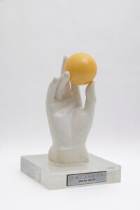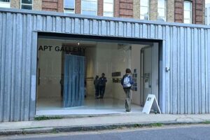
Mika Horibuchi, “Draw the Curtain” and Brittany Nelson, “Controller,” An exhibition at PATRON Gallery that ran from June 25–August 13, 2016.
The exhibitions of Mika Horibuchi and Brittany Nelson, on view this summer at PATRON Gallery, highlighted a noir quality of both artists’ work. Horibuchi, in particular, is exploring ambiguity as a genre. Her work occupies the gallery’s front space with an installation of pseudo- trompe l’oeil paintings, including a meticulous array of puzzle pieces on the floor, at least as solemn as they were playful. Nelson takes mystification equally seriously. Her silvery tintypes have an air of resurrection—as if a technique from the past could revive objects from the future.
In “Controller,” Nelson’s tintype photographs were mysterious, yet instructional. Nelson, a graduate of Cranbrook Academy of Art, is currently a professor at the Virginia Commonwealth University in Richmond. Julia Fischbach, who co-founded PATRON with Emanuel Aguilar, commented on Nelson’s witty presentation style and the well-equipped studio where she trains her students. Gazing at her works, I felt I gained an understanding of the artist’s preoccupation with ways of knowing, from the scientific to the absurd.
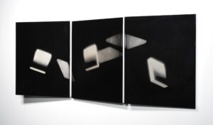
Primary shapes levitated on dark emulsions; renderings of geometry with an almost spiritual quality. There was a signpost aspect to the orientation of Nelson’s works, each with their own oblique cant against the wall. One work, titled Map #1, includes an amorphous orb of boxes and arrows, hovering in a low corner of the tintype like ants around picnic food, each miniature arrow carrying more than its own weight of information. Due to their slanted structure, the photographs asserted an outward presence in the space, yet their placement was simultaneously particular and arbitrary. As these works migrate from the gallery, one might expect to find them as sculptural objects placed on a shelf or table, perhaps even along the base of a wall, as two of the tintypes were placed here.
Megalith #2, the largest of Nelson’s eight works in the show, also has the most skewed orientation, tilted toward the viewer by degrees and adjusted in multiple directions. At PATRON, it hung at a confrontational angle, as if rising to meet the viewer who turned the corner into the second gallery. The works occupy dimensions under utilized in gallery architecture. You might think of them as tilting in orbit, each with a nuanced gravitational plane.
An artist equally absorbed by dimensionality or the lack of it, Horibuchi’s work, at first glance, is all surface finish and precision installation. Her paintings of curtains have a convincing photographic appearance that does not hint at deeper meaning. But she merges technical ability with
sleight of hand. The work promotes a basic question: Is a thing what it looks like it is?
The tightly executed works were sparsely arranged and made to construct a larger stage.
Horibuchi, a BFA graduate of the School of the Art Institute, lives and works in Chicago, which surely had an influence, as her work was coded
for PATRON’s space. The result is a quiet reminder of the power of presentation. If you choose to play Horibuchi’s game, the gallery itself must be
implicated in the construction.
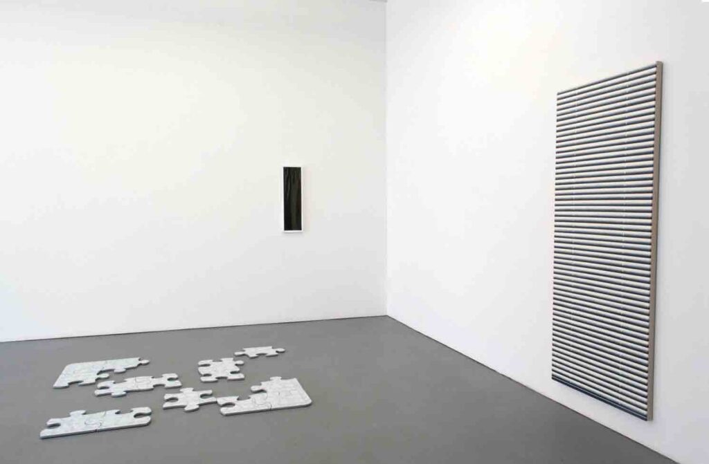
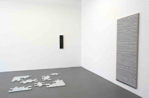
Horibuchi’s exhibition title, Draw the Curtain, reinforced a theme of concealment and exposure rooted in the physical layering of objects. Six oil paintings of curtains were framed behind dark Plexiglas and spaced at irregular intervals, white frames vanishing into the wall (especially in bright sunlight). In order to decipher the unusual narrowness of the paintings, it was necessary to observe the corresponding dimensions of the
room’s walls and doors. Small details were relevant: the paintings were the same width as a thin column on the wall.
Screen Door (oil on linen) hung opposite the entrance. Even studying Horibuchi’s floor work, Puzzle, and mentally rearranging the carefully
disconnected pieces, it was not until gazing upward toward the ceiling that a pattern came into focus.
The gallery director explained that the decorative ceiling tiles, original to the building, were echoed in the design painted on the fiberwood board pieces. Though the displayed puzzle pieces could not form a whole, the discovery of an embedded visual code hinted at a solution Both Horibuchi and Nelson’s art poses riddles. Imagine Photoshop after death. Through mastery of their mediums, they question the limits of representation and bring humor to a morbid fascination with unknown forces.
Kate Hadley Toftness
Kate Hadley Toftness investigates collection-based teaching and engagement programs at museums and alternative spaces with permanent archives. She works as the Archival Collections and Public Engagement Manager at Rebuild Foundation. She holds a B.A. from Yale University and an M.A. from the University of Chicago.
Volume 31 number 1, September / October 2016 pp 29-30