
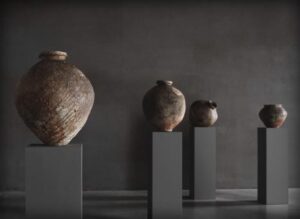
Tsujimura Shiro: Pots in the Terrace Gallery, (courtesy: Axel Vervoordt Company)
Sam Vangheluwe
“More light!”
Johann Wolfgang von Goethe’s last words
(courtesy: Axel Vervoordt Company)
Taste is just about the last category that comes to my mind when I think of art (beauty being the very last). And good taste, I abhor. When confronted with it off-guard, I cringe. I eschew it. Didn’t Fernando Pessoa say that there is nothing as distasteful as a tastefully decorated interior? However, like it or not, I reckon good taste is Axel Vervoordt’s very trademark. Exceedingly good taste.
Axel Vervoordt is internationally renowned as interior designer to the well-heeled. I gather that Sting, Kanye West (Ye) and Robert De Niro are among his clients. He runs galleries in Hong Kong and Wijnegem, Belgium. As the latter is only a stone’s throw away from my home – within easy cycling range – I decided to give Hong Kong a miss for now. And, incidentally, I would like to point out that no stones were thrown in this undertaking.
The Axel & May Vervoordt Foundation and the Axel Vervoordt Gallery are situated in Kanaal, a redeveloped industrial site along the Albert Canal, 15 minutes east from Antwerp. It comprises residential buildings, offices, gardens and galleries.
In this to Belgian standards, sparsely built-up area, the towering silos and apartment blocks loom from afar, like a rocky outcrop. Upon entering the site, one feels one is setting foot in a tiny city, or a futuristic hamlet. Contrasting with the concrete high-rise are undulating verdant alleys with rough, uneven concrete pathways meandering through them. Very beautiful, very tasteful, Japanese-like. Bura-bura.
A badge, to be obtained from reception, allows entry to the art rooms/buildings. I only discovered this after half an hour or so of straying aimlessly. This, combined with my constitutional resistance to museal instructions, made the whole experience a tad labyrinthine. Bura-bura.
The permanent exhibits are in the main accessed via light locks: using your badge, you open a door and are met with near complete darkness. Venture on, gingerly probe the murk, and eventually you reach a dimly lit space, where an artist has dramatically installed his/her work. I couldn’t help being reminded of the Haunted House in the fairgrounds of my youth. Indeed, the gallery’s brochure itself speaks of ‘a dark labyrinth.’ An entire building is dedicated to Anish Kapoor’s ginormous steel dome (‘At the Edge of the World’, 1998), only moderately smaller than the building itself. A substantial merry-go-round would fit under it. I found it oppressive. As in a Haunted House ride, one feels physically and emotionally challenged, yet at the same time, somehow cheated.
More or less the same with James Turrell (‘Red Shift,’ 1995). In inky blackness, you grope your way around a few corners and you are finally met with an oblong of faint reddish light. This installation has the merit of inviting contemplation. However, I found the ambiance so thoroughly oppressive – I was gasping for air and light – that I soon crept toward the exit at breakneck speed.
A similar sustained obscurity in the Henro/Ma-Ka halls. A few skylights bored through a thick concrete ceiling, in conjunction with walls painted black, make it impossible to, well, see what is exhibited. Which is all the more regrettable, since as the flyer mentions, a number of paintings were present, apparently. Notably, some by the undervalued Jef Verheyen. A sepulchral atmosphere.
Into the light again. The grain silos. Walking in between them is a overwhelming experience, particularly when you look up: it is vertiginous (the sale price of the apartments on the top floors makes your eyes water as well). The ground floors of the silos have been refurbished into exhibition, or rather installation spaces. Here too, darkness rules. One proceeds from one metal door to the next, like a bank-robber opening a series of vaults. Once inside, the door closes behind you with a thud. What is inside I found underwhelming, on the whole. The objects/installations you encounter, once your gaze is accustomed to the relative obscurity, appear vacuous. The explanatory text you meet on your way out is trite. I mostly fail to see any organic relation between the physical installation and its purported significance. Especially if it claims to be of a social/political/ecological nature.
As interior designers, Axel Vervoordt & family cannot but be aware of the peril of subsuming works of art within the category of (tasteful) decorative objects (just as the latter are exhibited as objets d’art). A painting (for example), is not an adornment. Knowing this, many artists superimpose an intellectual cause on their work, attribute social/political meaning to it. Misguidedly, in my very personal and wayward opinion. The Vervoordts are experts in good taste. Are they trying to stave off accusations of superficiality, by exhibiting art engagé (art with a cause)?
Temporary exhibitions are shown in the Patio Gallery and the Terrace Gallery. The former being the most beautiful space of the whole site: white walls and zenithal light. That’s it. No pot plant, no table with receptionist and ballpoint pen on a chain. The Terrace Gallery is a fine space, but the dark walls I do not like.

Photography: Jan Liégeois (courtesy: Axel Vervoordt Company)
Of the previous exhibitions I saw, Michel Mouffe impressed me the least. His mainly monochrome paintings engage for a short while, and then you start wondering what the use is of the central bulge in each canvas. Must be missing something. Seems to me like the kind of painting that is easily welcomed into interiors such as the heart-rendingly tasteful Vervoordt spaces. They would effortlessly slot into the elaborated décor. Another kettle of fish were the paintings by Angel Vergara (Les belles idées reçues – The Beautiful Received Ideas). They engage. By themselves. However, the back-story does nothing for me. Socially/culturally woke as it may be, the fact they were initiated in children’s workshops and on the streets of Marseilles, then ‘finished’ in his studio in Brussels, is, frankly, irrelevant. The accompanying flyer invites the attentive viewer to catch glimpses of the initial stages. Indeed, I witnessed visitors eagerly trying to detect the children’s naïve doodles in the rich fabric of these predominantly non-figurative works, at close range. While this is not quite a capital sin, in my view it is not the way to contemplate paintings, especially when the dimensions of the works as well as the ample space, invite the visitor to contemplate from a distance.
Deserving nothing less than superlatives is the pottery of Tsujimura Shiro (°Nara, 1947). His pots instantly bring to mind the shin-gyo-so categories of Eastern aesthetics, expanded upon recently by Alex Kerr. Shin being formal, gyo semi-formal, and so informal. In Asian pottery this corresponds to: Chinese porcelain (shin); Korean ceramics (gyo); and Japanese earthenware (so). Or, identifying ceramics by the sound they emit when tapped: “ting” – “clink” – “clunk”. Tsujimura’s pots are every inch so – “clunk”. They are simplicity embodied. Yet one never tires from contemplating them. When set up in a group (as some were in the Terrace Gallery), they begin to interact, to acquire even more personality. One can perfectly imagine sharing one’s life with them. They may be intensely relished by the champions of good taste, but they reach far beyond that. Tsujimura’s pottery, as all true art, embraces its proper share of tragic. It may, and indeed sometimes does fail: see the pots that collapsed partly or totally during (or before?) the firing in the kiln. These vessels are simultaneously simple utensil, sculpture, painting (the potter started out as a painter), and, if you like, installation. As the curator of Japanese pottery Cora Würmell put it, Tsujimura’s pots are “timeless, authentic works that draw their powerful charisma from the primal forces inherent in nature.”
In conclusion: despite my misgivings concerning taste, and my dislike of art (painting) being displayed in ceremonious darkness, ultimately, on the whole, I walk away from Kanaal with a positive sentiment. Was I overpowered by the architecture, the layout? Won over by vicarious gratitude for so much attention and space dedicated to art? Somehow, I cannot help looking forward to new exhibitions. If only there was a bit more light.
Axel Vervoordt Antwerp,
Kanaal, Stokerijstraat 19, 110 Wijnegem, Belgium
Axel Vervoordt Hong Kong,
21F, Coda Designer Centre, 62, Wong Chuk Hang Road, Entrance via Yip Fat Street (next to Ovolo Hotell), Hong Kong